
Our World in Charts
Our World in Charts is a unique collection of hundreds of charts published by The Outlier. The charts cover key issues both in South Africa and around the world on topics such as education, economy, politics, sport and more. Republish our charts for free.
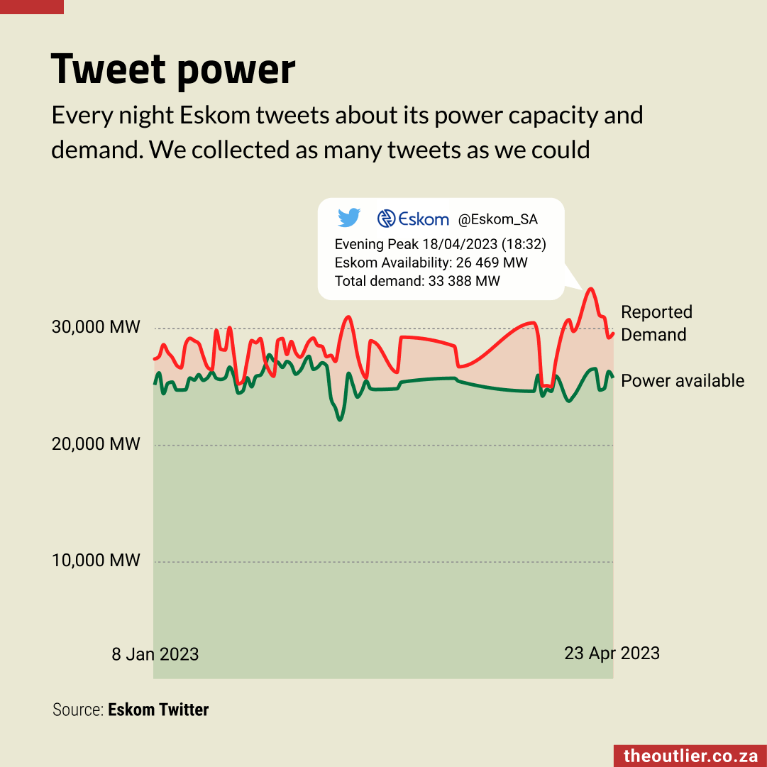
Most evenings Eskom uses Twitter to share details of the current demand for electricity and how much power is actually available. A typical tweet also includes details of renewable power available and open-cycle gas turbines in use. For power and data nerds it’s a lot of useful information in a concise package and also a good view of the power(less) situation in South Africa.
— 5 May, 2023Subscribe to the weekly newsletter for more charts like this
Read by 10k+ professionals every week ⭐️⭐️⭐️⭐️⭐️
Our charts have been featured in ...