

Our World in Charts is a unique collection of hundreds of charts published by The Outlier. The charts cover key issues both in South Africa and around the world on topics such as education, economy, politics, sport and more. Republish our charts for free.
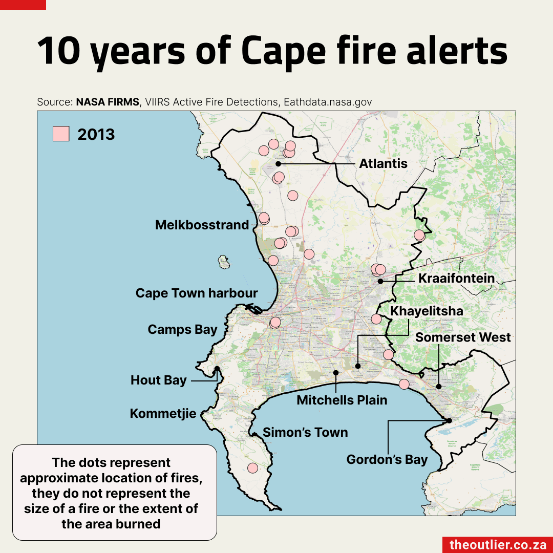
- Cape Town recorded its highest number of fire alerts in 2015
- 2023 alerts were concentrated around Simon’s Town
- Collected by Nasa satellites, alerts track activity not the exact number of fires
Using Nasa Earth data on fire alerts in Cape Town for the past 10 years as an indicator of activity reveals patterns across the different years. The highest number of alerts in the past decade, for example, was recorded in 2015. Represented by the blue dots, these were mostly in the Hout Bay area. The majority of the 2023 alerts on the Cape Peninsula (red dots) were concentrated further south, closer to Simon’s Town.
The hot, dry summer months mark the start of Cape Town’s fire season, which traditionally starts in November and peaks in February or March the following year. The extent of the Cape’s most recent fire season is still to be determined, although satellites have detected more than double the number of fire alerts compared to any of the previous 6 years.
Note that fire alerts indicate activity and not necessarily the exact number of fires.
— 22 February, 2024Subscribe to the weekly newsletter for more charts like this