2024: The Outlier’s Year in Review
2024 has been a huge year for training for us at The Outlier. We’ve run our in-person Data Storytelling workshop more than a dozen times, training close to 150 people, including media communication professionals, academics, economists, analysts and bankers.
We ran virtual versions of the course for journalists around the world, including AIJournalism students at the LSE, and had a great amount of fun presenting the workshop to corporate groups, including Unilever.
We experimented with a month of dataviz training webinars. Branded Out to Lunch with The Outlier, the idea is to share a few core skills in 30 minutes over lunch hour. In the first series, we covered basic spreadsheet skills, how to make maps and lessons we’ve learnt from making 500+ charts. You can view recordings of these on our YouTube channel.
This year also saw our first intake of students to the African Data Journalism Academy, set up under our parent company, Media Hack Collective. It brought together 11 mid-career journalists from newsrooms across Africa to teach them valuable data skills to add to their storytelling toolkits. This five-month, part-time course in data journalism was made possible through a grant from the Bill and Melinda Gates Foundation.
We’ll be launching new courses in the new year, including on AI and data visualisation, and easy ways to make good-looking visualisations in Excel.
- Find out more about our DataStorytelling workshops
- Secure your spot: January 2025 bookings are open
- If you have any suggestions about skills you’d like to learn about in 2025, let us know by emailing hello@theoutlier.co.za
Outlier Insights
One of The Outlier’s longer-term goals is to become a leading source of reliable and accessible African data. To this end, we’ve be steadily building Outlier Insights, our public data and charts service for Africa’s researchers, analysts and decision makers. We’ve been steadily adding to it throughout the year and there are now 59 datasets available, all of which have an accompanying data visualisation and all of which are free to download and reuse.
Some of the more popular sets are:
Our World in Charts
Making charts is core to what we do at The Outlier. The idea here is not to make pretty graphics to accompany a story, but to make obvious what is often overlooked when confronted with a mound of data.
Visualisations are handy in revealing patterns in otherwise hard-to-understand spreadsheets or for telling the story you want to tell. Charts are obviously not a substitute for doing the maths and working out the numbers, but they can give act as an excellent starting point for your audience or stakeholders to dig deeper into your data, story or analysis.
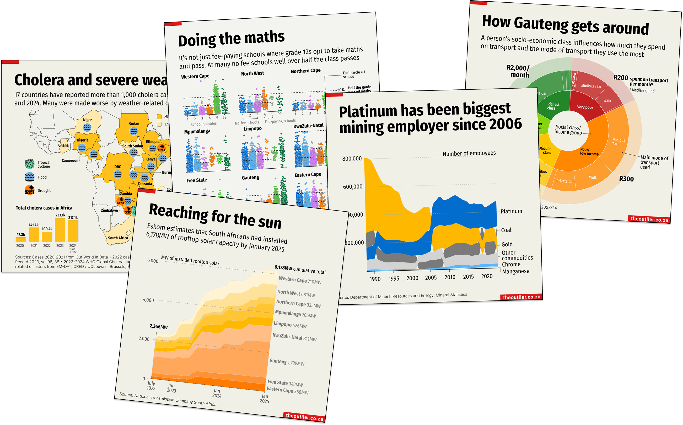
Our small team has produced 201 charts this year – usually while juggling many other demands – bring the total number of charts in the Our World in Charts collection to 657! Browse the full collection
Top Our World in Charts topics
- 88 charts about the economy, business and the cost of living
- 27 charts about governance, politics and local government
- 22 charts about sports
- 19 lifestyle charts
- 14 charts about climate change, renewables and the environment
- 10 education charts
- 10 charts about crime
- 7 charts about health
- 2 charts about loadshedding
- 2 charts to surprise you
Awards
Our trophy cabinet got a little fuller this year with two major international awards. We were particularly pleased when Perfect Storm, our data project about the vulnerabilities and lessons to be learnt from the devastating Durban floods in 2022, was selected from more than 1,250 international entries to the Covering Climate Now journalism awards. Winning the ‘extreme weather and its impacts’ category, the judges praised the ‘sharp and suspenseful writing’ and ‘deft data work’. Superb, they said.
The project won best data visualisation in the WAN-IFRA Digital Media Awards Africa. The judges said:
‘It’s no mean feat to compile such a detailed report packed with meteorological and socioeconomic data in a country where weather-related reporting is nearly always superficial at best. To then also present the facts in such a way that a compelling narrative unfolds – from a night of watery terror to a major city’s long-term survival plans – is even better. While the research is top-notch and the storytelling engaging, the digital presentation is equally well done. The reader doesn’t feel overwhelmed and the mix of static and interactive graphics is well balanced.’
This year’s focus was on South Africa’s transition to cleaner energy. Our Road to Jet project pulled in specialist writers, photographers and the entire Outlier team to produce a project that we believe captures the complexities and the challenges of a just energy transition.
Impact
Data and visualisations have the power to make a difference. We learned this during the Covid when our visualisations of the pandemic waves became a key indicator for millions of people eager to know whether things were getting better or worse.
Our Covid charts also appeared in official presentations and, more recently, charts we made with SECTION27 about sanitation in Limpopo’s schools have been widely shared (including in Parliament) and are part of an ongoing legal case.
At least 50 other publications or organisations have republished our charts this year, including Statistics SA. Our loadshedding data was picked up by the Treasury, the department of planning, monitoring and evaluation and Parliament. Our content is also regularly featured in the Daily Maverick and other local publications.
In their round-up of the stories that ‘moved us, surprised us, challenged us or made an impact’ in 2024, the staff of the Pulitzer Center chose our special feature on South Africa’s just energy transition. It’s an honour to be included along with such well-respected company. Explore the collection
South Africa faces a pivotal energy transition and the data news website The Outlier provided a remarkable road trip to five provinces, exploring the risks and opportunities of the transition to cleaner energy, in a nimble online presentation. — Christine Spolar, Climate and labour editor, UK
In November, Outlier editor and co-founder Alastair Otter was invited to speak at the Africa Journalism & Media Summit in Harare, Zimbabwe, which explored the theme ‘Reinventing Local Journalism in the Age of Disruption’.
Follow us on social
We’ve enjoyed spending more time engaging with our followers on LinkedIn this year (we’ve grown our audience by more than 60%, most of which is organic growth). If you don’t follow us yet, find us here. Alastair also shares regular brain downloads and updates from the trenches. Find him here.
We have an amazing community of 15,000 followers on Instagram, who seem to appreciate the short-form power of a good chart. Our content has been viewed more than 673,000 times. If you’re not in the circle yet, give us a follow.