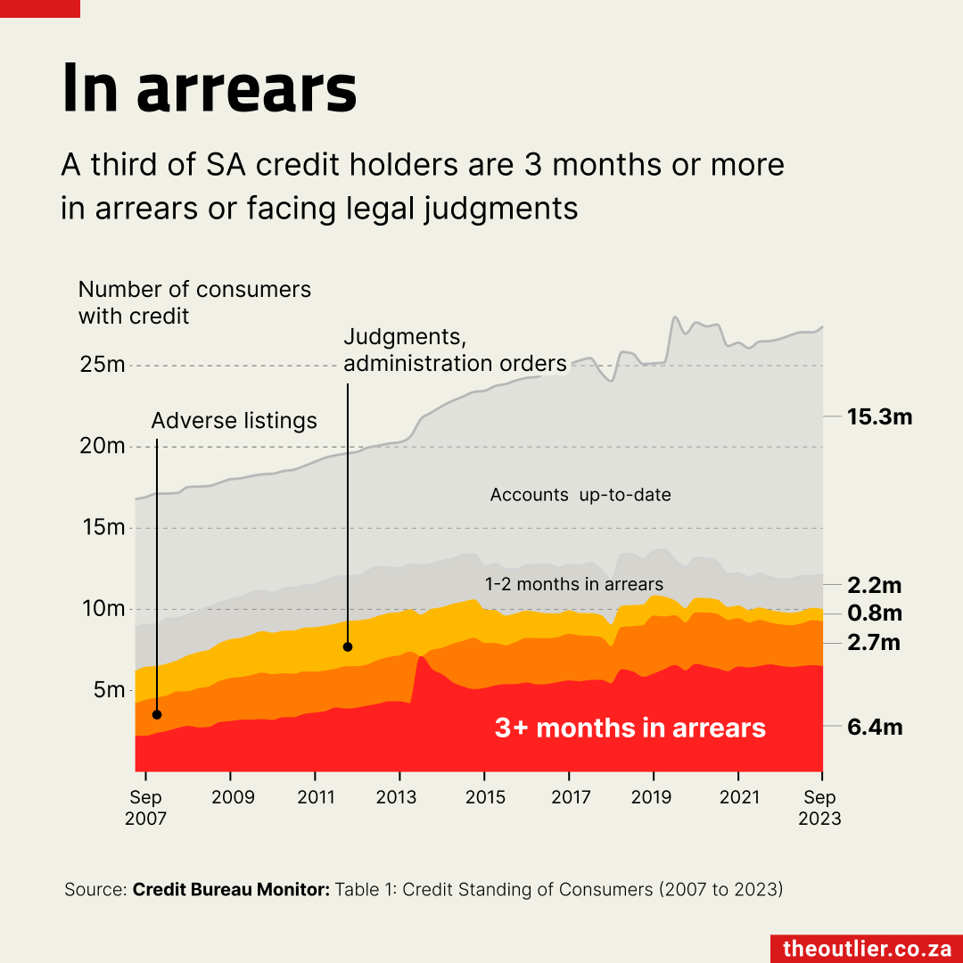

Outlier Data Bites
It’s getting hotter: 1 dataset, 5 charts
Last year was the hottest year on record and exceeded the Paris Agreement target of 1.5 degrees Celsius above pre-industrial levels for the first time since records began in 1850.
Disastrous as that is, it does offer a chance to learn more about the different ways that a dataset can be visualised.
Here are five charts that use mostly the same data but tell stories in different ways.
#1 Highlighting the key points
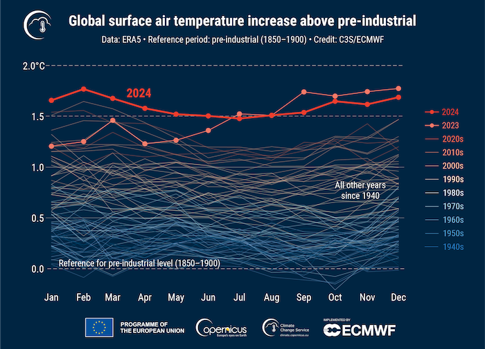
Source: Copernicus Climate Change Service
I like this chart a lot because it mirrors the techniques we teach in our workshops, and then improves on them slightly.
The use of colour evokes an understanding of what’s going on. You can almost feel the (relatively) icy period of the 1940s and 1950s compared with the heat of 2023/2024. The scale on the side also uses colours to mirror a temperature scale, emphasising what’s being looked at.
We usually advise people to de-emphasise the context points (the years before 2023) and emphasise the key values (2023 and 2024). In this case, the lines are coloured very lightly but still provide the context of changing temperature. (Compare this with the next chart which uses the more common greyscale lines for the years before 2023).
Another thing worth noting is that the legend on the right-hand side performs a dual purpose: it tells us which lines are which, and it adds meaning by visualising the change over time. On its own, the legend provides vital information.
#2 Annotating to get the message across
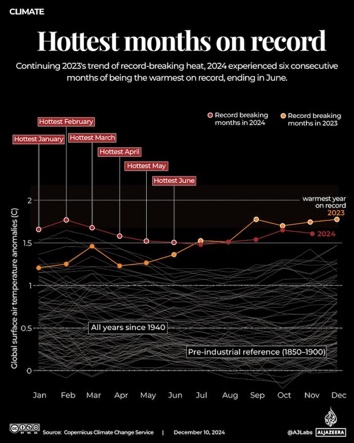
Source: Al Jazeera
This chart is similar to the previous one, but includes extra information. While the previous chart highlights the top two years, this one adds labels for the hottest months, driving home the seriousness of the change. The labels give weight to the fact that 2024 had six of the hottest months. As the data only goes up to November 2024, a full 12-month total is not included.
Annotations can add significant value to a chart when done properly. Without them, readers might only conclude that 2024 was ‘mostly hotter’ than other years. The labels give them additional, ‘quotable’ insights.
This chart uses the more traditional greyscale for lines representing years before 2023. This is generally clearer than using dozens of colours, but the subtle use of colour in the previous chart to indicate change is a good addition.
By offering readers easy takeaways, your charts can have a secondary effect of readers sharing these insights with others.
#3 The ups and downs of a ridge chart
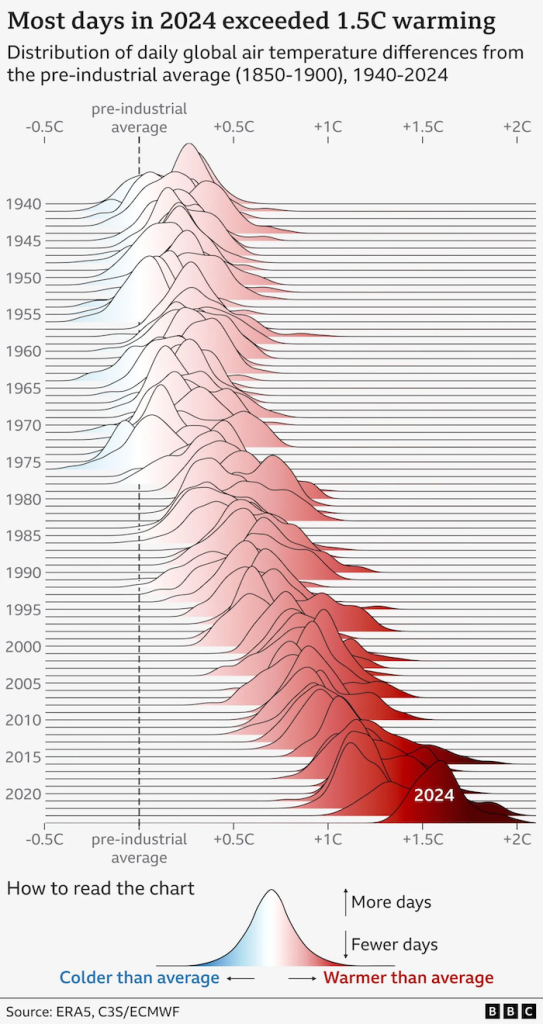
Source: BBC
Ridge charts have become quite popular, and the BBC’s version gives a good idea why. Partly it is because of the charts’ organic shapes. They aren’t particularly useful for accuracy, with the overlapping ridges obscuring some of the data points while making others more prominent. But they do give a clear impression of trends.
Cognitively, readers may take a little while to grasp the specifics of the data but most will quickly and clearly see the pattern. In general, the less time readers need to spend interpreting a chart, the better.
This is probably not the best chart type for most situations, but in this instance, I think it conveys a clear and accessible point. Ultimately, that is why we create charts: to help readers understand and even ‘feel’ the data.
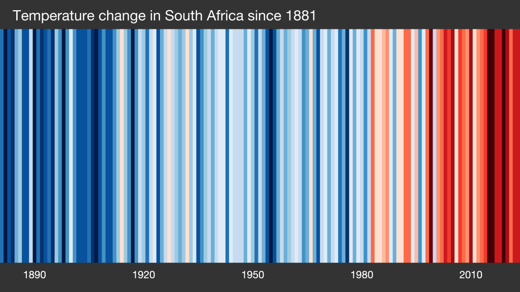
#4 All the stripes

Source: Show your stripes
The climate stripes visualisation is probably one of the most common representations of this data. The version above has been deliberately stripped of all labels. Most readers will immediately recognise what this chart represents. Even if they don’t know the specifics, they are likely to be able to figure out that things are getting hotter thanks to the simple colour gradient. The cool blues shifting to the dark red of the most recent years is instantly understandable. The warming stripes graphic style was created by Ed Hawkins and has become a standard visualisation of climate change.
The latest update adds a new dark red stripe for 2024, a colour introduced last year when 2023 broke all previous records.
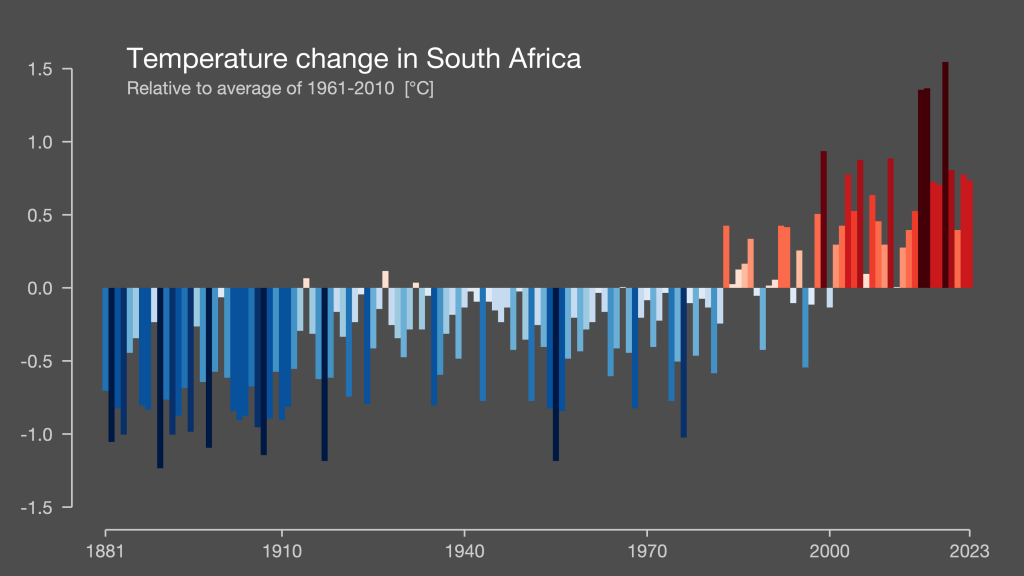
Top tip: Ed Hawkins also runs a website where you can generate climate stripes for different countries. 👇 Here are two variations for South Africa: one is the more traditional vertical 100% stripes; the other is a more descriptive column chart showing changes above and below the baseline.
#5 Back to basics
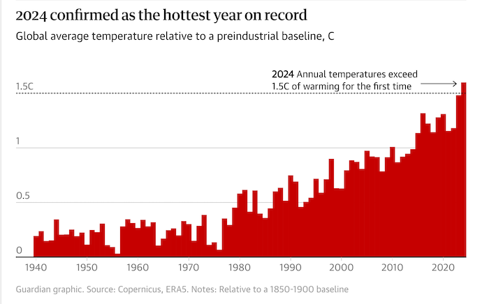
Source: The Guardian
Rather than comparing monthly temperatures, this Guardian chart compares annual temperatures for each year. It also highlights the all-important 1.5 degree Celsius mark, which was breached in 2024. This remarkably simple chart makes a clear point: 2024 was a standout year on the back of 2023, which was itself significantly hotter than previous years.
Again, a single annotation draws attention to the most critical data point, and the bold 1.5 degree line emphasises the exceeded target.
So many ways
One of the things that we often do in our workshops is ask everyone to create a chart. Most participants use the dataset we provide and yet they usually produce vastly different charts, just like the charts above. The key is understanding your audience and what you want to communicate. This will help you decide on the kind of chart to make.
Notebook
- If you’d like to find out more about our data storytelling workshops, visit the Outlier Learning website. We also do custom training. Contact us on hello@theoutlier.co.za
- If you’d like stories like this delivered to your inbox every week, sign up to our free data-driven newsletter.
The big list of data visualisation resources 2025
By Alastair Otter
Every year I update update my list of favourite data-related resources (podcasts, newsletters, websites and guides). The core of the list remains relatively stable across years but publications do come and go and podcasts go silent.
When I first started this list it was mostly focused on journalism-related data resources. Over time this has shifted towards the broader data and visualisation community.
This is an opinionated list, not a comprehensive one. There is as much not on this list as there is on. If there are things that you feel are egregious omissions please let me know (email at the end) so I can take a look.
First up …
Favourite blogs & publications
Are blogs coming back? It feels like they may be though I think they’re probably called ‘Substacks’ now. Either way there are some fine resources out there like:
- Nightingale is the newly revamped Data Visualisation Society website to go alongside the Nightingale magazine
- Flowing Data by Nathan Yau ought to be at the top of every data visualisation practitioner’s reading list. Awesome ideas, regularly
- Chartable by Datawrapper is chock-full of great tips and deep dives into things like colour and accessibility and more
- PolicyViz by Jon Schwabish is a great companion to his equally good books
- ChartR was recently bought by Sherwood News but still does a great newsletter with chart ideas
- Effective Data Storytelling by Brent Dykes is the companion blog to his excellent book of the same name
- Codera‘s blog (and companion newsletter) mostly features SA-focused charts that are great for sparking ideas
Must-read newsletters
A mix of newsletters covering data sources, story ideas, techniques and examples of data journalism.
- Data is Plural by Jeremy Singer-Vine, a weekly newsletter with interesting datasets. You can also catch up on previous datasets with the Data is Plural datasets spreadsheet
- How to speak Data by Andy Cotgreave is a monthly newsletter covering everything from AI and data to chart disasters on TV
- Off the Charts by The Economist (you now need to be a subscriber, but it’s almost worth the cost of a subscription alone)
- Quantum of Sollazzo by Giuseppe Sollazzo, a long-time favourite
- How to Read this Chart by The Washington Post is extremely accessible reading on chart-making
- Tools for Reporters by Samantha Sunne is not strictly data or viz but a great resource
- Data Elixir — Data science-y newsletter, more technical often but also covers a broad range of skill and interest levels
- Journalism AI — From the Journalism AI project at the LSE
- FILWD by Enrico Bertini is one of my favourite newsletters, mostly because it delves into the academic side of data visualisation and unearths hard to find research papers on the subject. But it does tend to be more technical
- The Upshot by The New York Times, great inspiration for data-based stories
- Latinometrics is charts about Latin America
Listen-up podcasts
There are relatively few data-related podcasts I listen to regularly. It may be that I’m missing some but many of the podcasts I used to listen to seem to have slowed down production or even stopped.
- The Policyviz Podcast by Jon Schwabish
- Data Viz Today by Alli Torban
- Explore/Explain by Andy Kirk
Outside of purely data-related podcasts there are tons of fantastic video podcasts I do listen to regularly:
- Lenny’s Podcast is aimed at product managers, but there is so much more that makes this an almost essential listen for me.
- Syntax is still my go-to for (mostly) Javascript-related shows, but broad enough to spark a ton of ideas.
- Developer Voices with Kris Jenkins is a quirky, deep-dive into tech that very often produces unexpected insight, like the DuckDB episode which is super-relevant to data work.
Tutorials & Guides
- QGIS Uncovered: QGIS YouTube tutorial series by Steven Bernard
- Curren Kelleher Tutorials: YouTube courses focused on learning visualisation tools like D3.js and more recently AI
- One Chart at a Time: A 56-episode series in which Jon Schwabish talks to experts about different charts and how they work. Hasn’t been updated recently but still worth watching
- Observable Demos and Tutorials: A series of YouTube videos introducing the Observable data analysis and visualisation platform
- Quartz Guide to Bad Data: By Quartz
- A Guide to Bulletproofing Your Data: By ProPublica
- Principles for Making Things for the Web: A guide by Noah Veltman
- How to Learn D3.js: Interactive guide to D3.js by Amelia Wattenberger is still one of the best ways to learn one of the more difficult visualisation tools
- Financial Times Visual Vocabulary: A downloadable guide to different types of charts and their uses
- Best Practices for Data Journalism: by Kuek Ser Kuang Keng
- Evergreen Data Visualization Checklist: Stephanie Evergreen
- Tamara Munzner YouTube series on data visualisation
- Amelia McNamara YouTube series on R and statistics
- Sports Data Analysis and Visualization by Matt Waite
- MapShaper command line tutorial part 1 and part 2 for some command line carto
- How to SQL: A guide for GIS users by Helen McKenzie
- BBC’s cookbook for R graphics, a guide to making BBC style charts in R
- Data Visualisation with Svelte is a great primer on how to harness the power of Svelte and D3.
Inspiration
- The Pudding
- From Data to Viz: A tool to help you decide on the best visual for your data
- r/dataisbeautiful — Reddit home of data inspiration and ideas
- The South China Morning Post Infographics
- Kantar Information is Beautiful awards showcase
- Mona Chalabi’s Instagram
- India in Pixels’s Instagram
- Reuters Graphics
- The European Correspondent’s Instagram
- Nadieh Bremer’s Pinterest
What am I missing? Drop me an email with something that you think ought to be on this list: alastair@theoutlier.co.za

with The Outlier
• Getting started with spreadsheets
• Learn pivot tables
• Data visualisation tips
• Map-making with data.