


How – and why – we switched from interactive to static data visualisations
In March 2022 we switched from making interactive data visualisations to focusing on static charts with tight constraints. It has undoubtedly been one of the best decisions we’ve made during the relatively short two-year history of our data journalism and visualisation company. Before switching to predominantly static charts we had a reputation for relatively complex […]
In March 2022 we switched from making interactive data visualisations to focusing on static charts with tight constraints.
It has undoubtedly been one of the best decisions we’ve made during the relatively short two-year history of our data journalism and visualisation company.
Before switching to predominantly static charts we had a reputation for relatively complex interactive visualisations. We still do interactive charts for some of our work, like our Covid-19 tracker where the interactivity adds value. But for most other charts we now default to static charts with exactly the same size, a very limited set of colours, and preset fonts and font styles.
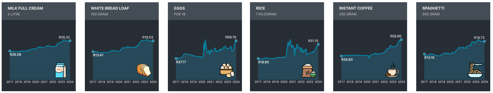
Making the change to static charts with limited options has completely changed the way we think about the visualisations we do. The “constraints” we’ve applied remove a lot of the decision-making usually found in design. We only have four main colours to work with (a few shades of those) and we have predefined fonts and sizes for each element on charts (titles, axis labels, source etc). The charts are always 1080px X 1080 px.
With the basics of colours, fonts, and chart shape out of the way, we can focus on the point of the chart rather than fiddling with the elements.
There are times when the limitations can feel frustrating and when it feels like a bit more freedom would make it easier to make a better-looking chart. Ironically it’s at exactly this point that the benefits of constraints really come into their own. Because you don’t have the option to make new colours, change fonts or stretch the chart to fit the data we’re forced to think outside of the immediately obvious solutions. That doesn’t guarantee that you’ll make a better chart but it does ensure you think through the options properly.

Not just about design
Static charts also have another major advantage over interactive ones in that they are portable. We can use them on our website, on Twitter, Instagram, or even via WhatsApp and we don’t have to worry about how they render. It removes a lot of headaches and makes it significantly easier to re-use the charts across multiple channels from our newsletters, to Instagram and Twitter.
We settled on the 1080 x 1080 size for our charts because it seemed the optimal size for most of the platforms we use. But we did design the template so the charts could easily be used at half-size without losing detail. In fact, at full size the charts are probably oversized but because they are most often viewed around 600px square that’s fine. We’d rather the fonts look a little too big at full size than have them too small on a mobile phone.
Focus on the message and value
The built-in limitations of static charts also forces us to think about the intention and message of each chart we make. Static charts are exactly that: static. We can’t have layers of information that users can click through to find the message or meaning. And when we can’t rely on interactivity to make visuals useful to people we have to think carefully about what we include in each chart. And in most cases, it’s more a case of how much we can leave out rather than how much we can include in each chart.
Static charts also force us to think about annotations. Interactive charts often rely on pop-ups to add extra value. With static charts, we have to think about other methods to add insight to a chart. Most often this is a compromise between how much detail we can add and how much we can leave out. For example, we often add values to bars when it’s important that readers understand the exact details and drop the x- or y-axis labels to avoid clutter. If the details aren’t as important then we may drop the direct labelling of bars and include the axis points for a sense of scale.
Speeding up
Making visualisations that are both good-looking and valuable to readers is never going to be easy. But setting constraints has massively improved our productivity. Earlier this year it would often take our very small team a few days to finalise one chart, a lot longer for interactive ones. We introduced our new limited static charts at the end of March 2022 and we’re now publishing at least one new chart every day of the week, more than 120 new charts in six months.
We still have a way to go to really refine our process of chart-making but I can highly recommend setting yourself some constraints and working within limits for a while to sharpen your chart skills. You can see our charts (including earlier ones) here: https://charts.theoutlier.co.za
Credit where due
To be fair the idea of static charts is not new. For years in a print newsroom that’s all we produced. And then the internet happened and new technology opened the way for increasingly complex interactive visualisations and we’re just now rediscovering the simple joys, and lessons, of those earlier days.
We’re not alone in this and there are a lot of good discussions in the data visualisation community over the value of interactive versus static visualisations, for example: @jburnmurdoch There are also a number of good papers looking at interactivity versus static charts and comparative examples.
On constraints, Alex Selby-Boothroyd of The Economist wrote a great introduction to their really tiny charts in the Off the Charts newsletter (subscriber only I think) but think thumbnail-sized charts.
We’ve also been heavily influenced into adopting static charts with constraints by the excellent work of Al Jazeera Plus, FT and The Economist.